
| Home | Reference | Manpage | Examples | Download | License | Contact |
| GRIDPLUS - Button Grid | |
||||||
|
| GRIDPLUS Button Grid |
In order to simplify creation of screen layouts, GRIDPLUS provides a GRIDPLUS button command mode. This uses a simple syntax to create a grid of buttons. The syntax is closely based on the GRIDPLUS Grid, except that the "label" text defines the text to appear on the face of the button. If the ICONS package is installed, the buttons may have icon images instead of text. This can be used as as simple method to create toolbars.
| GRIDPLUS Button Item Options |
| Examples |
This section contains a number of examples which illustrate the main GRIDPLUS button command mode features.
The following examples assume that the reader is familiar with the contents of the Grid/Layout page. Information given on that page will not be duplicated here.
Note: All examples assume that the GRIDPLUS package has already been "required" and the commands imported.
Window:
Source Code:
Comments:
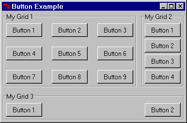
This example is based on Grid/Layout Example 2.
Here, however, three Grids contains buttons are created.
When using the GRIDPLUS button command mode
the "label" defines the text that will appear on the button. Separate labels are not
created for this command. The cell item begining with a dot is the widget (button) ID. The
buttons are created with names based on the name of the containing Grid and the widget ID.
For example: The for the ".mygrid1" cell defined by "{"Button 2" .2}"
a button widget is created with the name ".mygrid1,2". Please note that the
widget name does contain a comma - this is not a misprint!!
When the button is "pressed" (By default) a command width a name based on that of the
widget is invoked. In the case of the "{"Button 2" .2}" example the command is
called "mygrid1,2".
Window:
Source Code:
Comments:
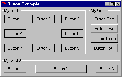
In this example ".mygrid1" has the -buttonrelief solid option
set. Also in ".mygrid1", the cell in the centre of the Grid is set to null ("{}").
This creates an empty cell in the Grid.
In ".mygrid2" the -size 10 sets the default
size for the contained button to be "10" characters wide.
In ".mygrid3" the cell defined by "{"Button 2" .2 20}" has a different size,
in this case "20" characters. If the cell definition contains an integer,
this number is used as the size for the button, overriding the default.
Window:
Source Code:
Comments:
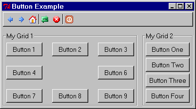
This example demonstrates creating a toolbar by using a Button Grid within a frame.
If the ICONS package is installed,
GRIDPLUS can easily create buttons with icon images.
".toolbar" contains a row of icon buttons. Icon buttons do not have button (label)
text, instead the name of the ICONS
package icon is specified with a colon (":") prefix. The widget (button) ID is optional
(See below).
All buttons can have optional pop-up/balloon help. This is mostly applicable when using icon
button to create a toolbar. The help text (if required) is specified a string starting with
a question mark ("?"). If the string is to contain more than one word it must be
enclosed within double quotes - Note: the question mark must be inside the quotes.
To create an Icon button it is only neccessary to specify an icon. In which case the
command invoked by the button would be based on the name of the button Grid and the name
of the icon.
For Example: "{.back :navback16 ?Back}".
In this case the widget would be called ".toolbar,navback16" and the command
invoked when the button is pressed would be "toolbar,navback16".
However, in this example a widget Identifier (begining with a dot (".") is also
specified to explicitly define the name of the widget and the command invoked when
the button is pressed.
For Example: "{.back :navback16 ?Back}".
".back" is the widget Identifier. ":navback16" is the name of the icon from the
ICONS package.
In this case the widget would be called ".toolbar,back" and the command
invoked when the button is pressed would be "toolbar,back".
The rest of the items are for options specific to the button. The vertical bar ("|") can
be used in place of a widget to create a separator bar.
In ".toolbar" the -space 0
option is set. This causes the buttons to butt together (No space between the buttons).
The -pad 0 option is also set. This
reduces the gap between the buttons and the edges of the enclosing Layout.
For the purposes of this example I wanted to have the toolbar on a raised, window width
frame. Do do this, put the toolbar inside a Layout (".toolbar_layout") with the
-relief raised option set. In the ".main"
Layout ".toolbar_layout" is set to span both columns and is streched to the window
width by attaching it to the left and right of the Layout cell by using the
:ew suffix.
Button Example 1
gridplus button .mygrid1 -title "My Grid 1" {
  {"Button 1" .1} {"Button 2" .2} {"Button 3" .3}
  {"Button 4" .4} {"Button 5" .5} {"Button 6" .6}
  {"Button 7" .7} {"Button 8" .8} {"Button 9" .9}
}

gridplus button .mygrid2 -title "My Grid 2" {
  {"Button 1" .1}
  {"Button 2" .2}
  {"Button 3" .3}
  {"Button 4" .4}
}

gridplus button .mygrid3 -title "My Grid 3" {
  {"Button 1" .1} {"Button 2" .2}
}

gridplus layout .main -title "Button Example" {
   .mygrid1:ns .mygrid2
   .mygrid3:ew -
}

pack .main
Button Example 2
gridplus button .mygrid1 -buttonrelief solid -title "My Grid 1" {
  {"Button 1" .1} {"Button 2" .2} {"Button 3" .3}
  {"Button 4" .4} {}              {"Button 6" .6}
  {"Button 7" .7} {"Button 8" .8} {"Button 9" .9}
}

gridplus button .mygrid2 -size 10 -title "My Grid 2" {
  {"Button One"   .1}
  {"Button Two"   .2}
  {"Button Three" .3}
  {"Button Four"  .4}
}

gridplus button .mygrid3 -title "My Grid 3" {
  {"Button 1" .1} {"Button 2" .2 20} {"Button 3" .3}
}

gridplus layout .main -title "Button Example" {
   .mygrid1:ns .mygrid2
   .mygrid3:ew -
}

pack .main
Button Example 3
gridplus button .toolbar -space 0 -pad 0 -buttonrelief flat {
 {.back :navback16 ?Back} {.forward :navforward16 ?Forward} {.home :navhome16 ?Home} | \
 {.reload :actreload16 ?Reload} {.stop :actstop16 ?Stop} | {.exit :actexit16 "?Exit Application"}
}

gridplus layout .toolbar_border -relief raised {
   .toolbar
}

gridplus button .mygrid1 -title "My Grid 1" {
  {"Button 1" .1} {"Button 2" .2} {"Button 3" .3}
  {"Button 4" .4} {}              {"Button 6" .6}
  {"Button 7" .7} {"Button 8" .8} {"Button 9" .9}
}

gridplus button .mygrid2 -size 10 -title "My Grid 2" {
  {"Button One"   .1}
  {"Button Two"   .2}
  {"Button Three" .3}
  {"Button Four"  .4}
}

gridplus layout .main -title "Button Example" {
   .toolbar_border:ew -
   .mygrid1:ns        .mygrid2
}

pack .main
Copyright © 2004 Adrian Davis.