
| Home | Reference | Manpage | Examples | Download | License | Contact |
| GRIDPLUS2 - Entry Grid | |
||||||
|
| GRIDPLUS Entry Grid |
In order to simplify creation of screen layouts, GRIDPLUS provides a GRIDPLUS entry command mode. This command mode is a "short cut" method to invoke the GRIDPLUS widget command mode with the default widget set create entries. All of the normal widget command mode functionality can be used. For example creating other widget types.
This uses a simple syntax to create a grid of entries. The syntax is closely based on the GRIDPLUS Grid and Widget.
Note: GRIDPLUS entry widgets can support Validations.
| Cut/Copy/Paste |
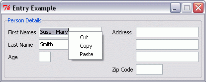
The GRIDPLUS entry widget automaticaly supports a right-click pop-up "Cut/Copy/Paste" menu when in edit mode -and- a "Copy" menu when In read-only mode.
Example:
When using gridplus set to set the state of a group of widgets; For entry fields "disabled" is converted to "readonly" to allow the pop-up Copy option to work. If you want to disable this behaviour use:-
option add *Gridplus.entryDisabled disabled.
| Setting The State of a Group of Widgets When an Entry is Modified |
It is possible to set the state of a specified group of widgets automatically when an entry is modified.
This can be specified for individual entries using ">group" (To enable) -or- "<group" (To disable) widget options (See Example 3).
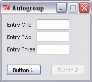
It is also possible to specify as a grid option that a specified group of widgets will be enabled when any of the entry widgets in the grid are modified using the -autogroup option.
Example:
gridplus entry .myentry -autogroup mygroup1 {
   {"Entry One"   .e1}
   {"Entry Two"   .e2}
   {"Entry Three" .e3}
}

gridplus button .mybutton {
   {"Button 1" .b1} {"Button 2" .b2 < %mygroup1}
}

gridplus layout .main -wtitle "Autogroup" {
   .myentry
   .mybutton
}

pack .main
Initially "Button 2" is disabled...
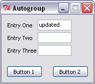
If any of the entry fields are modified "Button 2" is enabled...
Note: If the specified group has already been set to "normal" (enabled) it will be necessary to disable the group before creating the widgets.
| GRIDPLUS Entry Specific Item Options/Functionality |
See GRIDPLUS Widget Grid for a full list of item options/functionality.
| Invoking Commands/Events When The Enter/Return Key is Pressed |
There are two ways to specify commands/events to be invoked when the Enter/Return key is pressed while an entry has focus:-
Example: Setting "-entrycommand <Tab>" will cause focus to move to the next widget in the same way as pressing the TAB key.
Note: Where both options are used the command/event specified by the ~command option is invoked.
| Examples |
This section contains examples which illustrate the main GRIDPLUS entry command mode features.
The following example assumes that the reader is familiar with the contents of the Grid/Layout and Widget pages. Information given on that page will not be duplicated here.
Note: The example assumes that the GRIDPLUS package has already been "required" and the commands imported.
Window:
Source Code:
Comments:
When using the GRIDPLUS entry command mode the
"label" defines the text that will appear as a label to the associated entry. The cell
item begining with a dot is the widget (entry) ID. The entries are created with names
based on the name of the containing Grid and the widget ID.
For example: The for the ".mygrid1" cell defined by "{"Label2" .2}"
an entry widget is created with the name ".mygrid1,2". Please note that the
widget name does contain a comma - this is not a misprint!!
In ".mygrid2" the widget IDs are to the left of the label text. This will create
entries which are to the left of the label text.
In ".mygrid3" each cell definition contains only a widget ID or label text. In this
example a "matrix" of entries is created, each row and each column has one label. A
"null" cell definition is used to create an empty cell in the top left of the Grid.
".mygrid3" also has the -width 15
option set. This sets the default entry width to "15" characters (The normal
default is "8" characters).
The column labels ("Label A" and "Label B") have a
:c suffix - This causes the
labels to be centred in the containing cell.
Window:
Source Code:
Comments:
In this example the cell defined by "{"First Names " .1 +}" has the +
option set. This causes the associated entry to be given keyboard focus when created.
If more than one entry for a window is given focus the last one will take effect.
Note: The label in this cell has a trailing space. Adding one or more trailing spaces
to the end of the longest label for a column will create additional space between the labels
and the associated (entry) widgets.
".mygrid1" also has the -width 20
option set. This sets the default entry width to "20" characters.
In ".mygrid1" the cells defined by "{"Age" .6 3}" and "{"Zip Code " .7 8}"
have a different width, in this case "3" and "8" characters respectively. If the
cell definition contains an integer, this number is used
as the width for the entry, overriding the default.
Cell definitions "{"" .4}" and "{"" .5}" demontrate that labels can have a
null value.
Entry Example 1
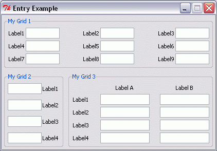
gridplus entry .mygrid1 -title "My Grid 1" {
  {"Label1" .1} {"Label2" .2} {"Label3" .3}
  {"Label4" .4} {"Label5" .5} {"Label6" .6}
  {"Label7" .7} {"Label8" .8} {"Label9" .9}
}

gridplus entry .mygrid2 -title "My Grid 2" {
  {.1 "Label1"}
  {.2 "Label2"}
  {.3 "Label3"}
  {.4 "Label4"}
}

gridplus entry .mygrid3 -width 15 -title "My Grid 3" {
  {}         {"Label A:c"} {"Label B:c"}
  {"Label1"} {.1}    {.2}
  {"Label2"} {.3}    {.4}
  {"Label3"} {.5}    {.6}
  {"Label4"} {.7}    {.8}
}

gridplus layout .main -wtitle "Entry Example" {
   .mygrid1:ew  -
   .mygrid2:ns  .mygrid3:ew
}

pack .main
Entry Example 2
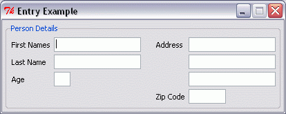
gridplus entry .mygrid1 -width 20 -title "Person Details" {
  {"First Names " .1 +} {"Address" .2}
  {"Last Name" .3}      {"" .4}
  {"Age" .6 3}          {"" .5}
  {}                    {"Zip Code " .7 8}
}

gridplus layout .main -wtitle "Entry Example" {
   .mygrid1
}

pack .main
| Reading and Setting GRIDPLUS Entry Values |
The values of the GRIDPLUS widgets are stored in a global array with a null name.
For Example:
global {}
For GRIDPLUS Entry widgets the array element has the same name as the widget: Thus the value of ".entry1" in ".mygrid" is referenced as "$(.mygrid,entry1)".
The recommended method to set GRIDPLUS entry values is to use the gpset command.
For Example:
gpset .mygrid,entry1 "John Paul"